.jpg.900f6d1bc80a5a156f3ba09ea0e4b3d7.jpg)

Jason Ross
-
Posts
6,720 -
Joined
-
Last visited
-
Days Won
50
Content Type
Profiles
Joomla Posts 1
Chicago Cubs Videos
Chicago Cubs Free Agent & Trade Rumors, Notes, & Tidbits
2026 Chicago Cubs Top Prospects Ranking
News
2023 Chicago Cubs Draft Picks
Guides & Resources
2024 Chicago Cubs Draft Picks
The Chicago Cubs Players Project
2025 Chicago Cubs Draft Pick Tracker
2026 Chicago Cubs Draft Pick Tracker
Blogs
Events
Forums
Store
Gallery
Everything posted by Jason Ross
-
Offseason Top Prospect Lists
Jason Ross replied to CaliforniaRaisin's topic in Cubs Minor League Talk
This feels more in line where I'd put both Hope and Smith based on age/production. I think they're both prospects with upwards arrows, but neither had production above A-ball and Hope is a baby. -
On paper, yes. Which I guess could be used to defend two different arguments. If you want to say that injuries are more likely to happen during ramp up, having a more deep and defined staff for the beginning of the year (and when other teams may also be experiencing ramp up or injuries) could be a good thing. Or that you'll be less likely to have to rely on rookies in the early part of the season. It could also be argued that starting the season off with the most impact is best as you play the hardest part of your schedule.
-
I don't want to stump fully for Hoyer (I got my gripes), but I think adding an MLB arm, while DFA'ing a raw, 22-year old reliever who really struggles to control the baseball does feel like an "all-in" move, no? I think Arias has a potential future as a member of an MLB bullpen, but he's pretty far away yet. Mechanical inconsistencies and good not elite stuff+ has him in a pretty risk-heavy category right now.
-
Welcome to NSBB! And yes, good call. The Dodgers have seen multiple starters drop due to injury and really haven't done a great job developing arms recently either - Bobby Miller has the look of a monster and yet the Dodgers can't seem to figure out a way to help get him to that finished product. Ultimately, it feels like maybe geography played a stronger role here than maybe he or Wolfe made it seem originally.
-
This all goes hand in hand with my biggest gripe on the offseason, and it's just that I feel like the Cubs took the "depth" mandate a bit too far? It almost feels like in lieu of a bigger, more substantiative addition on the pitching side, the Cubs have been more than content with a "more the merrier" approach instead. Which, IMO, isn't the same impact. The hope is that the Cubs can ride out the first half and more easily target a more impactful player at the deadline, but it also feels a bit risky to go into an unknown market hoping there's something there you want at a better price than you could have gotten in, say, January. Does feel like a little extra is riding on the Horton/Brown/Wicks/Birdsell group than I'd have wanted. And hell, I'm the prospect guy!
-
It kind of feels like the bullpen doesn't lack depth. Even if Thompson is a placeholder (and I kind of think he is, myself) there's...kind of a breaking point in terms of numbers and it feels like the Cubs are there. But what do I know? Would really hope that the team works on culling that a bit if they're going to keep adding.
-
It feels contradictory to worry about the ~10m or so that we got dinged on the LT for Barnhart/Mancini and then be upset that the team traded a recent draftee for a top-10 position player in baseball, doesn't it? On one hand, we're upset that the team doesn't put forth the effort and resources to bring in transformative talents, instead, playing on the fringes for a "raise the floor" type of addition, while on the other, being upset when the Cubs do just that. To TT's point, it feels a bit "damned if Jed does, damned if he doesn't", no? Secondly, as has been discussed, the LT overage played almost 0 role in this offseason. The Cubs haven shown while they'll toe the LT line, there's no blowing past it. Meaning that the overall spending is likely the exact same. Per Ricketts (who, yeah, I know), per Sharma, per Mooney, per Trueblood, it's been reported and said that the team can spend more than they are right now and payroll won't be significantly reduced (~$10m or so max). That $10m isn't changing the offseason, and the Cubs aren't shying away from Nick Pivetta because it'd cost a wee bit of IFA money and an extra 5th round pick. They just weren't going to spend on a QO player to begin with. Don't get me wrong, I've got qualms with the offseason. You'll have to let me put aside my disdain for Ricketts here - sadly I've come to accept his vision for the Cubs spending as the truth here, so while I think he sucks, he won't factor into this. Where I do find some faults are in places like the rotation. Mathew Boyd and Colin Rea as the rotational additions is too much risk for me and think the team has, to date, missed an opportunity to really upgrade there. Generally speaking, I think it's been a good offseason. There's more to be done, they still need a bench bat and an RP. I won't swear off any chance of signing Tucker - in fact, they probably are the betting favorite if we're being honest, though, with the caveat of "we'll see". The team feels deeper, the lineup feels stronger, and at the worst, the Cubs have the young pitching depth to fill in if need be, or at least until the deadline when the team can make another splash play.
-
I'm not sure if you caught my comparison between Shaw and Smith, and how much I really think the recent BP rankings are bad, Shaw and Smith have a lot in common; both NCAA picks, drafted 13/14th respectively and as of right now, play the same position with some questions as to whether or not they will be 3b long term. Shaw outhit Smith on wRC+ at each level, and posted a 144+ wRC+ in his first full-go at Double-A and Triple-A (which I think is like a 90-95% outcome for Smith next year. It's up there). Yet, Shaw, who was #21 on their last last year, sits four spots lower than Smith. Regardless, I think people are getting way over their head as of now on Cam Smith. He's a good prospect! But the way some are acting, they're acting as if he's an uber prospect...when he's really on a path similar to that of Matt Shaw. And Shaw is good...really good! But Smith hasn't even accomplished that much yet.
-
Sign me up for Finnegan. With some tweaks, there's a guy there.
-
Nevermind. Signed with LAD.
-
Scott trains at Tread (Tyler Zombro). Might also be a bit of a reason the Cubs are breaking their normal RP protocol here.
-
Legendary Blues Alternate Uniform next year
Jason Ross replied to UMFan83's topic in Chicago Cubs Talk
I dont know about you, but if given the choice to be told the truth of something with a common, normal name, and someone with the name Ding Dong or Sammy Sofa, I know what I'm picking. "Hello, my name is Dr. Ding Dong. We are sorry to inform you that we will have to amputate your leg..." Sounds way better than Dr. Chris. -
Yeah, I've thought about this as well. As much as I don't love Rea, it does allow the Cubs options as the year goes. Horton or Brown or Birdsell could super force action there, or you could jump on a guy at the deadline.
-
Caissie's defense is much better than youre giving it credit for. He's got a legitimately plus arm and the athleticism isn't bad. Might he DH down the road? Sure. I don't particularly think it's imminent. But between the two, I'm choosing Caissie, myself. More on that, later. Don't want to give all of my secrets away. Regardless, while you can envision a world where both can find time, there also comes a time when we have to ask the best usage of prospects. Alcantara's best usage is likely in center. And with Busch at 1b, Happ here for at least another 2 years, PCA here for 5...you have to wonder if the best usage for an OFer in the system (with other prospects who could also work as a COF in due time, or other draft picks backfilling some spots) isn't to use combinations of "Shaw or Triantos" and "Caissie or Alcantara" to create a player that the system is more or less missing. It's also a numbers game. I love our prospects, but we shouldn't expect them all to be a thing. Moving some for more established players may create a risk of trading the guys who do become regulars but it also mitigates your risk of having your entire future hinged on players you may or may not ever establish themselves, too. There's a push and pull of it.
-
Legendary Blues Alternate Uniform next year
Jason Ross replied to UMFan83's topic in Chicago Cubs Talk
Yeah. These grow on me more and more. -
Ive been surprised as well to see him not be mentioned more. He feels like the guy the Cubs would be more willing to move and others should likely covet. AX Phil has him as very likely to get anothet option year as well (and he's usually spot on for those valuations). Youd think someone would be super enthused with him. Ive kind of viewed the team as pretty damn high on Caissie (just based on how they've moved him) and I guess I struggle to see a future with both as definitely finding a home in a Cubs OF with PCA. But maybe I'm just missing this and they viewed both as the future. Which is probably a good thing and somewhat of a bad thing (with how the Cubs are more tight pocketed than I think remains necessary the prospect hugging is a bit of a bug and a feature).
-
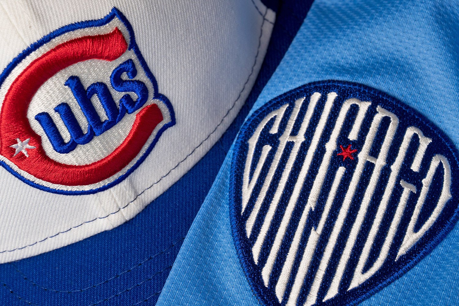 I'll get this out of the way at the top - I'm not someone who thinks the Chicago Cubs need an alternate look. The Cubs are one of the more classically dressed teams to begin with, and they could easily get away with pinstripes at home and their road grays only. That said, we must understand that uniform culture currently suggests all teams have multiple looks. For as much as I think City Connect looks are mostly superfluous, the Chicago Cubs will not shy away from these opportunities to have a wider variety of merchandise available to be purchased with alternate looks. Last night, they added a new uniform to the lineup while retiring another - the Wrigleyville City Connect (worn exclusively at home and on Fridays), which will leave the rotation in 2025. The first thing that stands out with their new uniform is that it is primarily powder blue. While many may remember the 1970s powder blue and pinstripe look the team used on the road, people may not know that 1941 the Chicago Cubs became the first MLB team to use a powder blue uniform. The team has a history in the color, even if they're not always remembered for it. Nike and the Cubs will use "uniform speak" to claim that the uniform is for the cities' history with the musical genre of Blues, but truthfully, I think this uniform has more to do with the team's history in powder blue than anything. I also don't think it should be lost that the light/powder blue and red motif is akin to the city's beloved flag. The logo on the breast is also a callback to the team's past - with the logo evoking that of the Chicago Federals (also known as the Chicago Whales), who played three seasons from 1913-1916 and were Wrigley Field's original team. Sporting an old wishbone C, it does just enough to be unique and new (completed with a six-point star in the logo, also a clear nod to the Chicago city flag), but not enough that it's difficult to tell that it's a wink and a nod to the history of baseball in Chicago. So, while it can't be called a "throw" back, it's certainly veering into "faux" back territory (a fictitious throwback) Paired with the powder blue top, the cap has a distinctive white panel on the front and uses the same Cubs logo from the chest. However, the hat is more "Cubs Royal" blue than powder, giving the team a double-blue look in areas. The name on the back, as well, will be royal, while the numbers will be red. If we're thinking about uniform design across sports, I think there are some general rules that most (if not all) good sets follow; They are generally of simple design They do not chase perceived current trends They evoke the team who's wearing them (think of this as "I don't need to ask who's playing") Most of the best-dressed teams in sports follow these guidelines, regardless of their specific sports. Why do the New York Yankees, the Chicago Bears, the Pittsburgh Steelers, the Michigan Wolverines, and the Detroit Red Wings always look good? They follow those rules. Teams consistently bouncing between looks (such as the Jacksonville Jaguars) generally don't follow those rules. Most teams, recently, who have released a clunker of a set almost always fall back on a throwback to revert and fix the errors in their ways. City Connect, in particular, has difficulty falling into the third category (the Boston Red Sox in yellow feels like a crime). The good news for the Cubs? I think these hit almost every one of these guidelines. They're mostly simple and don't overcomplicate things with too much going on. They don't chase current trends; instead, they use pieces from their history, and because they're using nods to their history, they will consistently look like the Cubs, whether they're wearing these or their pinstripes at home. It's why, generally speaking, I really like this set. They have a clean look and add small wrinkles to the set as a whole. If you like anything about the Montreal Expos (and I'll admit to having a really soft spot for them), you'll probably be excited as well, as they have a bit of an "Expo" vibe. They're a fine take on a powder blue look overall, even if some of the "uniform speak" Nike puts out about them being about Blues music feels...forced. If there's something I'm less of a fan of, I wish the hat was different. The logo on the hat feels cluttered and is too reliant on letters. A rule of thumb with full words on a hat - you can't read them from afar, and they become jumbled at that point, losing their effectiveness. A simpler logo, for example, maybe the Cubs bear with the bat, would have looked better, even if it wasn't identical to the chest logo. It would, however, be more legible from far away and would have stuck to the theme of "fauxback." I also think the name on the back may be a bit hard to read, as these will be in the royal-outlined-in-white instead of sticking with red, though that might be a "wait until you see them on the field" type of thing. Again, the Cubs don't need this uniform - it's superfluous. But if the Cubs are going to introduce an alternative look, they could do far worse than this. They have been confirmed to be used for "select home homes," I assume they'll just directly replace the Wrigleyville look on Friday afternoon games. Those old City Connect uniforms felt drab - these feel bright. They should look good on a Friday afternoon under the sun. So, while I don't need this uniform, they should be fun, and most importantly, they'll still look like the Cubs. Solid B from me. What do you think of the Cubs' new alternate uniforms? Do you like them? Hate them? What would you change? Let us know in the comments below!
 -
Just before the Cubs Convention is slated to kick off, and well into Thursday night, the Chicago Cubs dropped a surprise - no, it's not an extension with Kyle Tucker or anything crazy - but a new alternate uniform designed to replace their Wrigleyville City Connect uniforms...but are they any good? I'll get this out of the way at the top - I'm not someone who thinks the Chicago Cubs need an alternate look. The Cubs are one of the more classically dressed teams to begin with, and they could easily get away with pinstripes at home and their road grays only. That said, we must understand that uniform culture currently suggests all teams have multiple looks. For as much as I think City Connect looks are mostly superfluous, the Chicago Cubs will not shy away from these opportunities to have a wider variety of merchandise available to be purchased with alternate looks. Last night, they added a new uniform to the lineup while retiring another - the Wrigleyville City Connect (worn exclusively at home and on Fridays), which will leave the rotation in 2025. The first thing that stands out with their new uniform is that it is primarily powder blue. While many may remember the 1970s powder blue and pinstripe look the team used on the road, people may not know that 1941 the Chicago Cubs became the first MLB team to use a powder blue uniform. The team has a history in the color, even if they're not always remembered for it. Nike and the Cubs will use "uniform speak" to claim that the uniform is for the cities' history with the musical genre of Blues, but truthfully, I think this uniform has more to do with the team's history in powder blue than anything. I also don't think it should be lost that the light/powder blue and red motif is akin to the city's beloved flag. The logo on the breast is also a callback to the team's past - with the logo evoking that of the Chicago Federals (also known as the Chicago Whales), who played three seasons from 1913-1916 and were Wrigley Field's original team. Sporting an old wishbone C, it does just enough to be unique and new (completed with a six-point star in the logo, also a clear nod to the Chicago city flag), but not enough that it's difficult to tell that it's a wink and a nod to the history of baseball in Chicago. So, while it can't be called a "throw" back, it's certainly veering into "faux" back territory (a fictitious throwback) Paired with the powder blue top, the cap has a distinctive white panel on the front and uses the same Cubs logo from the chest. However, the hat is more "Cubs Royal" blue than powder, giving the team a double-blue look in areas. The name on the back, as well, will be royal, while the numbers will be red. If we're thinking about uniform design across sports, I think there are some general rules that most (if not all) good sets follow; They are generally of simple design They do not chase perceived current trends They evoke the team who's wearing them (think of this as "I don't need to ask who's playing") Most of the best-dressed teams in sports follow these guidelines, regardless of their specific sports. Why do the New York Yankees, the Chicago Bears, the Pittsburgh Steelers, the Michigan Wolverines, and the Detroit Red Wings always look good? They follow those rules. Teams consistently bouncing between looks (such as the Jacksonville Jaguars) generally don't follow those rules. Most teams, recently, who have released a clunker of a set almost always fall back on a throwback to revert and fix the errors in their ways. City Connect, in particular, has difficulty falling into the third category (the Boston Red Sox in yellow feels like a crime). The good news for the Cubs? I think these hit almost every one of these guidelines. They're mostly simple and don't overcomplicate things with too much going on. They don't chase current trends; instead, they use pieces from their history, and because they're using nods to their history, they will consistently look like the Cubs, whether they're wearing these or their pinstripes at home. It's why, generally speaking, I really like this set. They have a clean look and add small wrinkles to the set as a whole. If you like anything about the Montreal Expos (and I'll admit to having a really soft spot for them), you'll probably be excited as well, as they have a bit of an "Expo" vibe. They're a fine take on a powder blue look overall, even if some of the "uniform speak" Nike puts out about them being about Blues music feels...forced. If there's something I'm less of a fan of, I wish the hat was different. The logo on the hat feels cluttered and is too reliant on letters. A rule of thumb with full words on a hat - you can't read them from afar, and they become jumbled at that point, losing their effectiveness. A simpler logo, for example, maybe the Cubs bear with the bat, would have looked better, even if it wasn't identical to the chest logo. It would, however, be more legible from far away and would have stuck to the theme of "fauxback." I also think the name on the back may be a bit hard to read, as these will be in the royal-outlined-in-white instead of sticking with red, though that might be a "wait until you see them on the field" type of thing. Again, the Cubs don't need this uniform - it's superfluous. But if the Cubs are going to introduce an alternative look, they could do far worse than this. They have been confirmed to be used for "select home homes," I assume they'll just directly replace the Wrigleyville look on Friday afternoon games. Those old City Connect uniforms felt drab - these feel bright. They should look good on a Friday afternoon under the sun. So, while I don't need this uniform, they should be fun, and most importantly, they'll still look like the Cubs. Solid B from me. What do you think of the Cubs' new alternate uniforms? Do you like them? Hate them? What would you change? Let us know in the comments below! View full article
-
Legendary Blues Alternate Uniform next year
Jason Ross replied to UMFan83's topic in Chicago Cubs Talk
Im a pretty big uniform dork. Ive been reading Paul Lukas' uni-watch and been a member of the Chris Creamer SportsNet long enough that it's a bit of a miracle I've managed to keep a partner. Totally agree on the City Connect hat! It was the only part of the last set I liked. Strangely enough, it's the cap this time that I *dont* like. -
Legendary Blues Alternate Uniform next year
Jason Ross replied to UMFan83's topic in Chicago Cubs Talk
Yeah, the white pinstripes below are are a miss. Plain white would look much better IMO. -
Legendary Blues Alternate Uniform next year
Jason Ross replied to UMFan83's topic in Chicago Cubs Talk
I think yes and no. Essentially, all of the uniforms are still designed by Nike at it's core, so I think the designers and the process are very similar. Current uniform rules are as follows: teams are allowed four uniforms + 1 city connect. So I think the designation here is important. What it allows the Cubs to do is have a fourth uniform in the rotation (home pinstripes, road gray, road blue top, home "Legendary Blues") while also adding a City Connect when 2.0 comes up. My expectation is this: the Cubs will not add a "City Connect" this year, but will add one next year and this will move to something away from "select" home games and will be more in line with the usage of the road-blues, where they will wear them more often (as I expect these will be a hit merch wise). -
Roki Sasaki signs with Dodgers (For Real)
Jason Ross replied to imb's topic in General Baseball Talk
It's either super desperate or done with intent. Straw's $15m ain't nothing. -
Roki Sasaki signs with Dodgers (For Real)
Jason Ross replied to imb's topic in General Baseball Talk
Toronto just acquired more IFA money... -
Kevin Alcantara made his MLB debut at the very end of the 2024 season. How good do we think the Jaguar will be when he arrives again in 2025? Image courtesy of © Kyle Ross-Imagn Images We continue today looking at the Cubs' top 20 prospects (as ranked by our readers here at NSBB), with Kevin Alcantara, who comes in at No. 5 on that countdown. Before you read about him, though, don't miss our previous posts on the current state of the Cubs' farm system, with my looks at some honorable mentions, the Cubs' Top Prospects #20-16 and the Top Prospects #15-11. #20 - Pedro Ramirez, INF #19 - Luis Vazquez, INF #18 - Michael Arias, RP #17 - Alfonsin Rosario - OF #16 - Drew Gray, SP #15 - Jonathon Long, 1B #14 - Fernando Cruz, SS #13 - Derniche Valdez, SS #12 - Alexander Canario, OF #11 - Cristian Hernandez, SS #10 - Brandon Birdsell, SP #9 - Jaxon Wiggins, SP #8 - Jefferson Rojas #7 - James Triantos #6 - Cam Smith 2024 Season Recap - Kevin Alcantara, OF Kevin Alcantara, the prized return for the much beloved Anthony Rizzo, has been a part of the Cubs' organization for the better part of his career. From a personal standpoint, it feels as though he's been around much longer than he has been; acquired in the summer of 2021, he hasn't been here that long. Entering 2024, the tall, lanky outfielder was slated to see action in Tennessee but had an outside chance at making noise in Iowa if he stuck the landing, but I didn't have "get his first MLB hit" on my bingo card, either. Starting the 2024 campaign, however, Alcantara really struggled through his first 29 plate appearances, going hitless while striking out 11 times. Despite the no-good first week+, the outfielder found his footing and tore through the league after that point, hitting .298, striking out 23% of the time compared to a 9% walk rate, and posted a 142 wRC+ through a tough Southern League. It was great to see the K% remain low - Alcantara is a tall drink of water, and pitchers can sometimes use those long levers to their advantage. Alcantara's time in Tennessee would end in early August, as he was promoted to Triple-A Iowa on August 6th. It didn't take long for him to make himself at home, hitting a home run in only his second game. There were a lot of positives for "The Jaguar" in Iowa, hitting a robust .292, to go along with a 123 wRC+, an ISO approaching .200, and walking 11/5% of the time. If there was a knock (and there was a knock), the K% was elevated, inching ever so close to the 30% threshold. The K% reminds us that he's not a finished product and that progress must be made. The good news is that it's a smaller sample size for a 22-year-old making their debut at Iowa - so while it's notable, it's not something to worry about - more or less, just something he'll need to polish moving forward. Regardless, it ended up with him getting a call to the majors for the last week of the season and even getting his first MLB hit. 2025 Season Outlook and Scouting Report: ETA - Summer 2025 Kevin Alcantara is very close to making himself a mainstay at the MLB level. Entering the 2025 season, Alcantara will just be a few months shy of celebrating his 23rd rotation around the sun - meaning he's still very much on the young side of things. He's all but assured to make his season's start in Iowa with the Triple-A Iowa Cubs as he looks to refine some of his bat-to-ball skills and work towards alleviating some of the strikeouts. If he can do that, Kevin will be among those considered this summer for a return to Chicago if an injury happens to an outfielder, being in the conversation with Owen Caissie, another top-5 Cub prospect. Who will be called upon may be a question of "who got hurt?" with Caissie being more likely if Michael Busch or Kyle Tucker were to suffer from an injury, but Alcantara being the chosen one if PCA went down, for example. Where things get a little messy is that there's still plenty of offseason to go, and Kevin Alcantara isn't guaranteed to remain with the Cubs. The 6'6" Alcantara is blocked at his (current) primary position of center field, with Pete Crow-Armstrong the de facto starter, and it looks like he might be a very good regular. While Alcantara's bat and glove would easily play in right field as well, he's a bit of a unicorn considering there just are not a lot of 6'6" outfielders who can hold their own in center field as opposed to being relegated to a corner, which gives him a unique upside. While the Cubs' trade rumors have all but dried up, it doesn't mean they aren't or can't be working on something in the background. At some point, there may need to be an internal conversation about "Caissie or Alcantara?" as the team debates how to infuse more talent into the MLB side. It may not happen in the offseason, but he would remain a hot name come July at the trade deadline. Overall, the outfielder looks like an MLB power-hitting outfielder capable of playing center field for the interim and shifting to RF later. To unlock everything, Alcantara must learn how not to be beat up and in with heat and continue to refine his approach. If he can make those final tweaks to his game, whether in Chicago or elsewhere, there would be a real all-star upside in the total package: Kevin Alcantara. What do you think of Kevin Alcantara? Do you think he will remain with the Cubs or be traded to another team? Do you think he has an all-star upside? Let us know in the comments below! View full article


